
Introduction
At this point in AP Statistics, you will have done lots of work with two-variable categorical data. Now, we will begin to explore two-variable quantitative data, using a mix of new graphical methods, numerical analysis of one-variable quantitative data, and new analytical methods for two-variable data, all to determine the association between the two variables. In this topic, though, we will just be focusing on graphical representation of two-variable quantitative data, how to describe them, and how to interpret what it means for the association of our variables
Bivariate Quantitative Data Set
When working with a two-variable, or bivariate, quantitative data set, each individual in your sample will have two different data points assigned to them, one for each variable. These two variables can also be interpreted as an ordered pair assigned to each item in the sample. By plotting these ordered pairs as points on a graph, we can create a scatterplot.
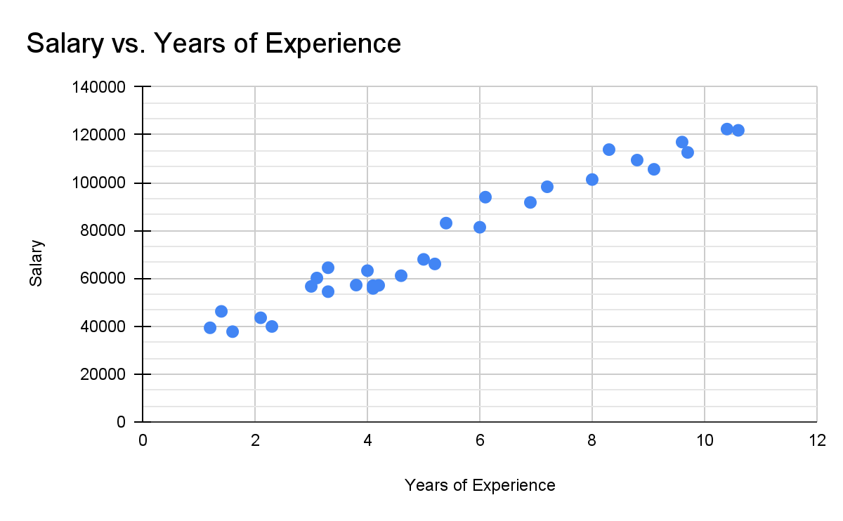
This scatterplot shows two variables, years of experience working at a company, and the individual’s salary. The axis represents years of experience, and the axis represents salary. Therefore in this graph, when looking at any individual point, we know that it represents a certain individual, and that the value is their years of experience, and the value is their salary.
With a scatterplot, however, we do not use the terms “ axis” and “ axis”, but rather the terms “explanatory variable” and “response variable”. This is because in a scatterplot we are testing if the two variables are associated, and more specifically if a change in one correlates with a change in another (remember that unless it is an experimental study to find the cause, we can only determine the correlation between variables and not causation). The terms explanatory and response variables are also very similar to independent and dependent variables, and so understanding one can help you understand the other.
When determining which variable is the explanatory variable, you want to think about which variable might be able to predict or explain the other one. For example, if your variables are number of trees in an apple orchard and number of apples produced by that orchard per year, the number of apples produced obviously can’t influence or change the amount of trees, and so the number of trees is your explanatory variable and the number of apples produced is your response variable. A common one to remember is that time will almost always be your explanatory variable, and it's much more common for things to change based on time than the other way around (an example of an exception could be number of people working on a project and time until the project is finished, where time until the project is finished would be the response variable and number of people working on it would be the explanatory variable)
Scatterplot Association
In the AP Statistics exam, you will likely be asked to describe the association of two variables given a scatterplot. When you are asked this, there are four things that you must describe to get full credit. These things are form, direction, strength, and unusual features.
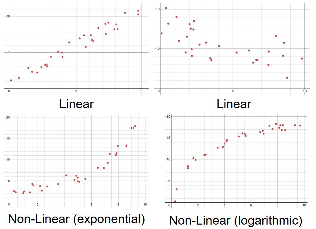
The form of a scatterplot describes its general shape. Generally, when you are describing scatterplot associations, you can say that it is either linear or non-linear. Linear associations are the type you will work with more in AP Stats. Graphically, they will appear as a straight line, and you can describe them by saying that for every unit increase in the explanatory variable, there is a constant increase in the response variable. Non-linear associations are less common, and include a variety of different forms, with some more common ones being exponential, logarithmic, quadratic, and inverse. All you will need to do for form, though, is notice that if the association is curved in any way, it is non-linear, and if it is straight, it is linear.
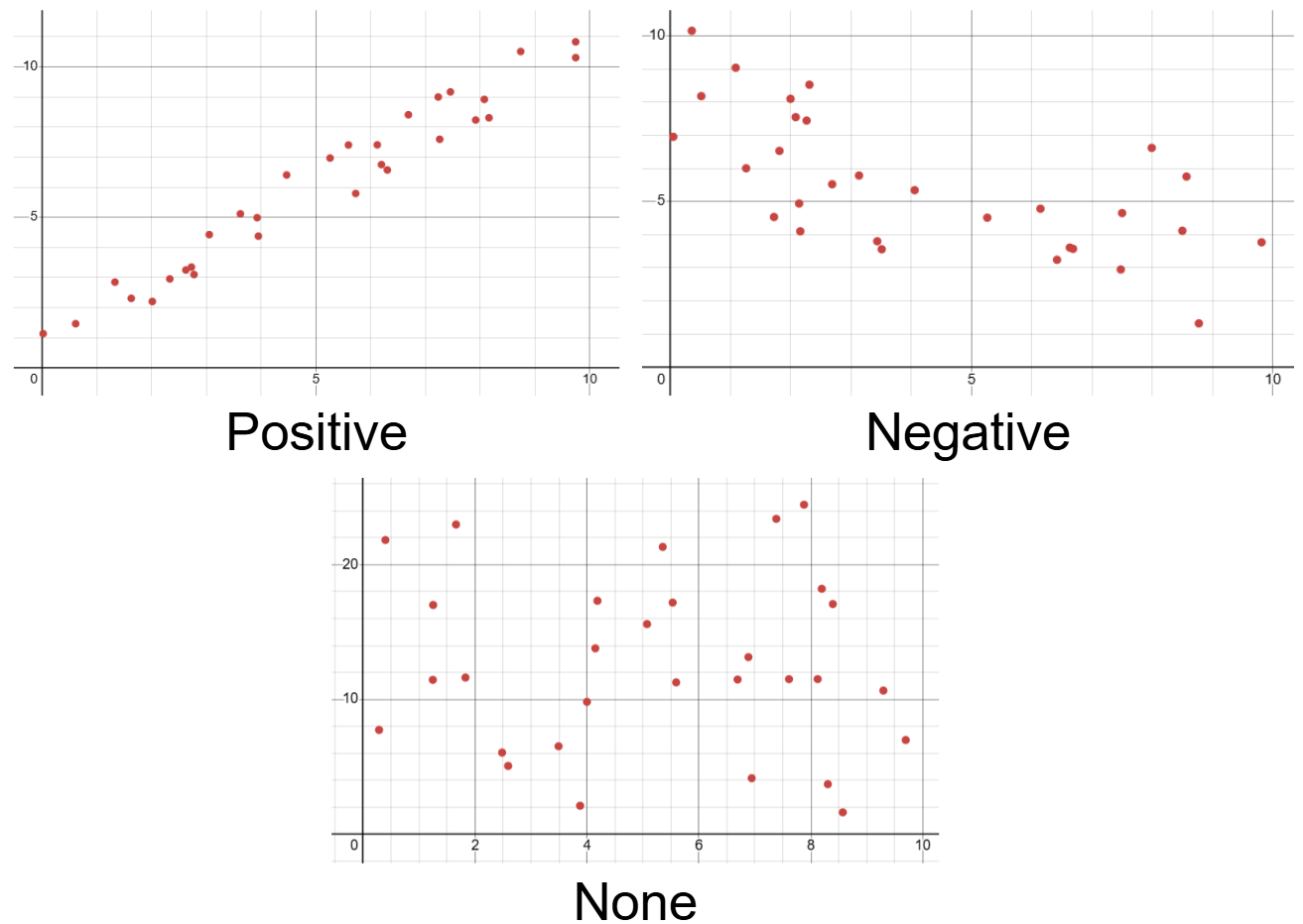
The direction of an association describes the direction the response variable goes during an increase in the explanatory variable. With a positive direction, the response variable tends to increase with an increase in the explanatory variable. With a negative direction, the response variable tends to decrease with an increase in the explanatory variable. If the direction of the association is horizontal, or zero, that means that there is no association between the two variables. It’s also good to remember that the direction of the association stays the same even if you switch which variable is the explanatory and response one.
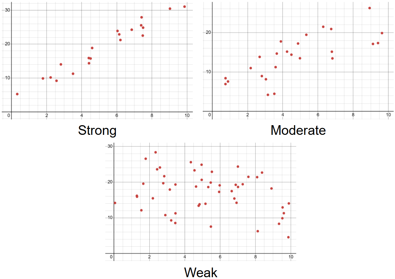
The strength of an association represents how well the general pattern is followed, or how well the change in the explanatory variable is correlated with a change in the response variable. The terms used to describe strength are strong, medium, and weak. It’s important to keep in mind that the strength does not have to do with the number of the data points, but rather how concentrated they are towards a certain pattern. A scatterplot with fewer data points that very strictly follow a trend will have a higher strength than a scatterplot with more data points that have much more variation in their response variable.
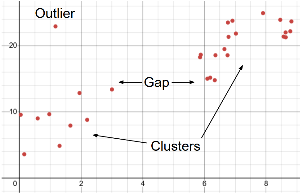
The last thing that you will have to explain when describing an association is any unusual features. This can be either individual data points, or clusters of data points that don’t fit into the trend of the data. It’s also worthy to remember that while outliers within the explanatory variable are noteworthy for describing an association, an actual outlier in a scatterplot instead has to do with exceptional variation in the response variable at a certain value of the explanatory variable. If there are no unusual features in a scatter plot, be sure to mention the fact that there are none, instead of just ignoring it. The scatterplot below shows examples of an outlier, cluster, and an explanatory variable gap in a dataset.
Let’s take these skills and apply them to the scatterplot we saw earlier, and analyze the association between years of experience and salary.

For form, we can see that the data points generally follow a straight line, and so it is linear. For direction, the salary of an individual increases as their years of experience goes up, so it is positive. For strength, we can see very little variation in salary compared to our general trend, and so we can say it is strong. For unusual features, none are present, so we can simply say no unusual features. We can now tie all of these ideas together, being sure to provide context, and create a proper description of the scatterplot’s association, which would look something like this:
“The association between an individual’s salary and their years of experience at a company is linear, positive, and strong, with no unusual features present in the data set”
By using this method of analyzing and describing associations in scatterplots, you can look at any sample of bivariate quantitative data and be able to make a reasonable claim about the relationship between the two variables.